
Understanding how people find and interact with a website starts with three core areas of web analytics: user acquisition, engagement, and user attributes. User acquisition explains where visitors come from, whether through search engines, direct visits, or email campaigns. Engagement focuses on what users do once they arrive, including how long they stay, how often they interact, and whether they return. User attributes provide context about who those visitors are, such as their location or device. Together, these metrics give a complete picture of website performance, helping identify what is working, what needs improvement, and how to better connect with your audience.
Understanding these metrics is important because they each answer a different piece of the performance puzzle. User acquisition shows whether your marketing efforts are actually bringing people to your site and which channels are worth investing in. Engagement reveals the quality of those visits, helping you see if users find your content valuable or leave quickly. User attributes add context by identifying who your audience is, allowing you to spot patterns in behavior across different locations or groups. Together, they help you make better decisions by connecting traffic, behavior, and audience insights into a clear strategy for improving your website.
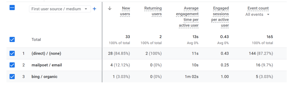
User Acquisition – First User Source / Medium
I used user acquisition to understand where my website visitors are coming from and which channels are most effective at driving traffic.
I use average engagement time to measure how long users stay and interact with my content, new users to understand how well I am attracting first-time visitors, and engagement to evaluate the overall quality and meaningful interactions of those visits.
Average engagement time prompt:
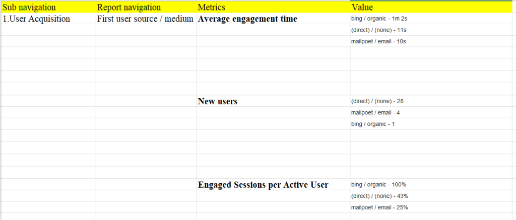
“When I sorted the average engagement time in descending order in the First user source/medium classification, the following result came out. Please explain”
Results:
bing / organic – 1m 2s
This is your strongest source. It likely brings users with clear intent from search, so they spend more time reading and exploring because the content matches what they were looking for.
(direct) / (none) – 11s
This is very low engagement. Direct traffic can include people typing your URL, bookmarks, or untracked sources. The short time suggests many users either aren’t finding what they expected or are just quickly checking the site.
mailpoet / email – 10s
This is also low. Email clicks often depend on how well the message matches the landing page. In this case, users may be clicking out of curiosity but not staying because the page doesn’t fully meet expectations.
Overall, Bing organic is performing best due to stronger intent, while direct and email likely need better alignment between user expectations and landing page content.
New Users Prompt:
“When I sorted the new users in descending order in the First user source/medium classification, the following result came out. Please explain”
Results:
This is showing where your new users are coming from, not how engaged they are.
(direct) / (none) – 28
Most of your new users are coming through direct traffic. This usually means people are either typing your URL, using bookmarks, or arriving from sources that don’t pass referral data (some apps, documents, or privacy-restricted links). A high direct number can also suggest weak tracking from other channels, so not all of these are truly “direct intent” visits.
mailpoet / email – 4
A small number of new users are coming from your email campaigns. This means your email is generating some new traffic, but it’s not a major acquisition source right now.
bing / organic – 1
Very few new users are coming from Bing search. This suggests your SEO or search visibility on Bing is currently limited, or your content isn’t ranking for queries that bring in first-time visitors.
Overall, your data suggests you’re relying heavily on direct traffic for new users, while email is minor and organic search is barely contributing to new user acquisition.
Engaged Sessions per Active User Prompt:
“When I sorted the engaged sessions per active user in descending order in the First user source/medium classification, the following result came out. Please explain”
Results:
This metric shows how many engaged sessions each active user generates, grouped by acquisition source. Higher percentages mean users from that source are more likely to return or interact multiple times.
bing / organic – 100%
Users from Bing organic are the most engaged relative to their size. Each active user is generating at least one engaged session on average, which suggests strong intent and good content relevance. Even though Bing may not bring many users, the ones it does bring are highly engaged.
(direct) / (none) – 43%
Direct users are less consistently engaged. Many may be one-time or low-intent visitors, or the traffic source may be mixed due to tracking limitations. Less than half an engaged session per active user suggests weaker repeat interaction compared to organic search.
mailpoet / email – 25%
Email users show the lowest engagement efficiency. This means only a small portion of users coming from email are generating engaged sessions, which often points to either weak targeting, misaligned messaging, or landing pages that don’t encourage further interaction.
Overall, Bing organic is producing the highest-quality users in terms of engagement, while direct and email traffic are bringing in users who interact less consistently.
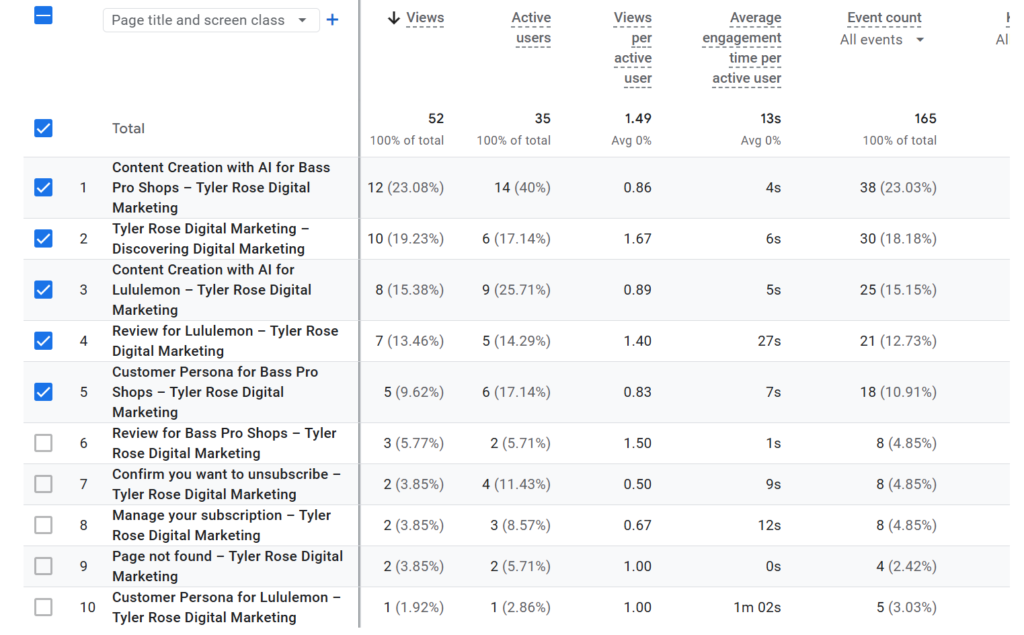
Engagement – Page Title and Screens
I used engagement to measure how effectively my website captures user interest and encourages meaningful interaction with the content.
I use average engagement time to measure how long users interact with my content, views to understand how much exposure each page is getting, and users to track how many unique individuals are visiting my website.
Average Engagement Time Prompt:
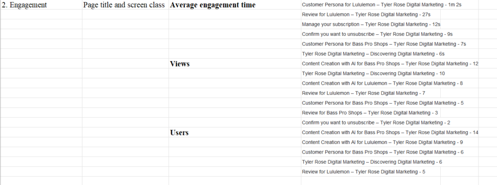
“When I sorted the average engagement time in descending order in the page and title screen class classification, the following result came out. Please explain”
Results:
This is showing how long users stay engaged on each page (Page Title / Screen Class), sorted from highest to lowest.
Customer Persona for Lululemon – 1m 2s
This is your strongest performing page. Users are spending the most time here, which suggests the content is valuable, relevant, and likely being read in detail (high informational intent).
Review for Lululemon – 27s
Still relatively strong engagement, but lower than the persona page. This suggests users are interested in the topic but may be scanning rather than deeply reading.
Manage your subscription – 12s
Low engagement is expected here because users usually come to this page with a quick task (e.g., changing settings) and leave immediately after completing it.
Confirm you want to unsubscribe – 9s
Very low engagement, but also normal. This is a confirmation/transactional page where users typically act quickly and exit.
Customer Persona for Bass Pro Shops – 7s
Low engagement compared to the Lululemon persona page suggests this content may be less relevant, less detailed, or not holding attention as well.
Tyler Rose Digital Marketing homepage – 6s
This is the lowest engagement, which often happens on homepage-type pages where users quickly decide where to go next or leave if it doesn’t immediately match their intent.
Overall, your longest engagement is on in-depth, content-rich pages (customer persona content), w
Viewers Prompt:
“When I sorted the views in descending order in the page and title screen class classification, the following result came out. Please explain”
Results:
This shows which pages are getting the most total views, sorted from highest to lowest.
Content Creation with AI for Bass Pro Shops – 12 views
This is your most viewed page. It suggests strong interest in AI-driven content creation for a well-known brand, likely driven by search or topic relevance.
Tyler Rose Digital Marketing homepage – 10 views
Your homepage is the second most viewed page, which is expected since it acts as a main entry point and navigation hub.
Content Creation with AI for Lululemon – 8 views
This also performs well, showing that AI + brand-specific content is a recurring interest area for your audience.
Review for Lululemon – 7 views
Moderate interest here suggests users are engaging with brand analysis or evaluation-type content.
Customer Persona for Bass Pro Shops – 5 views
This has lower but steady interest, indicating persona-based content is still relevant but not as strong as AI content topics.
Review for Bass Pro Shops – 3 views
Lower traffic here suggests less demand for this specific topic compared to Lululemon-related or AI-related pages.
Confirm you want to unsubscribe – 2 views
This is a functional page, not content-driven, so low views are normal and expected.
Overall, your data shows the strongest interest is in AI-assisted content creation topics tied to recognizable brands, while traditional review and persona content gets moderate engagement, and utility pages receive minimal traffic.
Users Prompt:
“When I sorted the users in descending order in the page and title screen class classification, the following result came out. Please explain”
Results:
This shows which pages have the most unique users, sorted from highest to lowest.
Content Creation with AI for Bass Pro Shops – 14 users
This is your strongest page in terms of reach. It’s attracting the most unique people, which suggests strong topical interest in AI-driven content creation for well-known brands.
Content Creation with AI for Lululemon – 9 users
This is also performing well and confirms that AI + brand-specific content is your main draw for new or returning audiences.
Customer Persona for Bass Pro Shops – 6 users
Moderate reach here suggests some interest in persona-style content, but it’s not as broadly appealing as the AI content topics.
Tyler Rose Digital Marketing homepage – 6 users
The homepage is acting as a secondary entry point. This is normal, but it also shows users are spreading across content pages rather than primarily landing on the homepage.
Review for Lululemon – 5 users
Lower unique user count indicates this content is more niche or less frequently discovered compared to AI-focused posts.
Overall, your audience reach is being driven most strongly by AI-based content creation topics tied to recognizable brands, while review and persona content attract smaller, more specific groups of users.
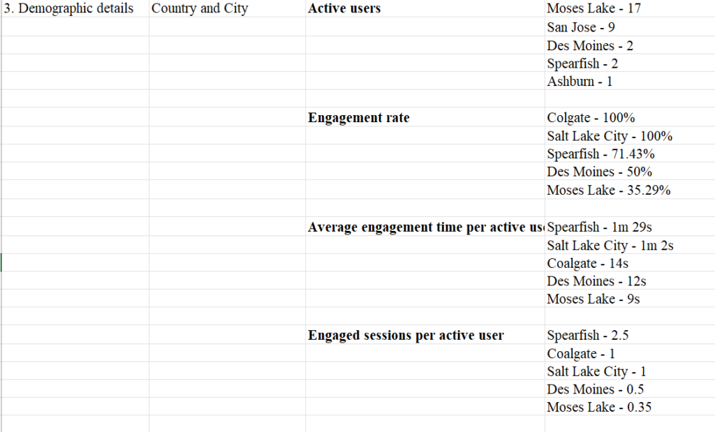
User Attribute – Demographic Details
I used City to identify where my website users are located so I can understand geographic patterns in my audience and tailor content or marketing strategies accordingly.
I use users to measure how many unique people are visiting my website, engagement rate to understand the quality and relevance of those visits, average engagement time to see how long users actively interact with my content, and engaged sessions per user to evaluate how often individuals return and engage beyond a single visit.
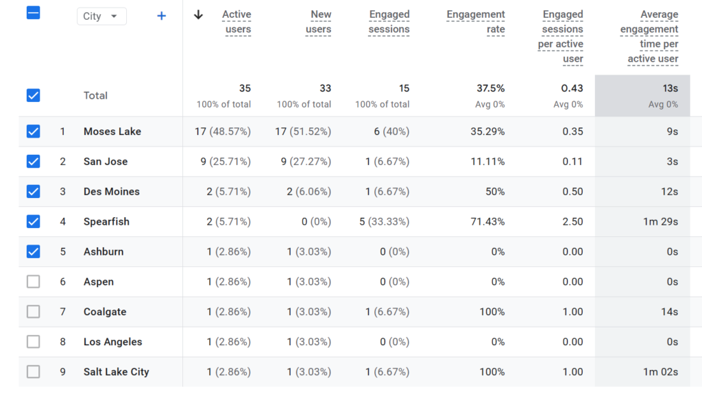
Active Users Prompt:
“When I sorted the active users in descending order in the City classification, the following result came out. Please explain”
Results:
This shows where your active users are located, sorted from highest to lowest.
Moses Lake – 17
This is your largest user concentration. It suggests a strong cluster of traffic from this area, which could be driven by a local audience, a specific referral source, or even automated/aggregated traffic depending on your setup. It’s notably higher than any other city, so it’s worth verifying whether this is expected or inflated by tracking behavior.
San Jose – 9
This is your second strongest location. San Jose is a major metro area with high digital activity, so this is more typical of organic web traffic and suggests real user interest from a tech-heavy region.
Des Moines – 2
Small amount of traffic, likely incidental or from a few individual users.
Spearfish – 2
Low but notable since it is geographically closer to your region. This may represent local interest or repeat users.
Ashburn – 1
Very minimal activity, likely a single user or session.
Overall, your traffic is heavily concentrated in Moses Lake and San Jose, with a long tail of small, scattered locations. The main thing to watch is whether the Moses Lake spike reflects real audience interest or a tracking/data grouping anomaly.
Engagement Rate Prompt:
“When I sorted the engagement rate in descending order in the City classification, the following result came out. Please explain”
Results:
This shows engagement rate by city, sorted from highest to lowest. Engagement rate tells you the percentage of sessions that were “engaged” (i.e., lasted long enough, had interaction, or met engagement criteria in GA4).
Colgate – 100%
Salt Lake City – 100%
These cities show perfect engagement, but this usually happens when traffic volume is very low. It likely means only a small number of sessions occurred, and all of them met the engagement threshold. With tiny sample sizes, 100% is common but not necessarily meaningful statistically.
Spearfish – 71.43%
This is strong engagement and more reliable than the 100% cities if it has more sessions behind it. It suggests users here are highly interested in your content and are interacting meaningfully.
Des Moines – 50%
Moderate engagement. About half of sessions are engaged, which suggests mixed intent—some users find value, others leave quickly.
Moses Lake – 35.29%
This is the weakest among your listed cities despite having the highest number of users. That combination is important: it means you have a lot of traffic here, but lower quality engagement overall compared to smaller cities.
Overall interpretation:
Smaller cities show artificially high engagement due to low sample size, while Moses Lake stands out as your highest-volume but lowest-quality engagement location, which is the most important insight for optimization.
Average Engagement Time per Active User Prompt:
“When I sorted the average engagement time per active user in descending order in the City classification, the following result came out. Please explain”
Results:
This shows average engagement time per active user by city, sorted from highest to lowest. It tells you how long users from each location typically stay engaged.
Spearfish – 1m 29s
This is your strongest-performing city in terms of attention. Even though it may not have the highest traffic volume, users here are highly engaged and spending meaningful time with your content.
Salt Lake City – 1m 2s
Also strong engagement. This suggests users from this area are genuinely interested and interacting with your content at a similar depth level to Spearfish, just slightly lower.
Coalgate – 14s
Engagement drops significantly here. Users may be clicking in but quickly leaving, suggesting weak relevance, low interest, or mismatched expectations.
Des Moines – 12s
Similar to Coalgate, this indicates low engagement. Users are likely skimming or bouncing quickly.
Moses Lake – 9s
This is the weakest engagement despite being one of your highest traffic cities. It suggests a large portion of users are not finding the content relevant or are leaving almost immediately.
Overall insight:
Smaller or mid-sized cities like Spearfish and Salt Lake City are producing higher-quality engagement, while higher-volume areas like Moses Lake are generating more traffic but much lower attention. This mismatch usually signals a need to improve content relevance or targeting for your largest traffic sources.
Engaged Sessions per Active User Prompt:
“When I sorted the average engaged sessions per active user in descending order in the City classification, the following result came out. Please explain”
Results:
This metric shows how many engaged sessions each active user generates on average, grouped by city. Higher values mean users from that location are coming back or interacting multiple times.
Spearfish – 2.5
This is your strongest city. Each user is generating multiple engaged sessions, which suggests strong interest, repeat visits, or deeper interaction with your content. Even if traffic volume is smaller, the user quality is very high here.
Coalgate – 1
Salt Lake City – 1
Both of these are stable but not outstanding. On average, each user is generating one engaged session, meaning users are interacting but not necessarily returning or extending their activity much beyond a single meaningful visit.
Des Moines – 0.5
This indicates weaker engagement behavior. On average, not every user is producing a full engaged session, which suggests many visits are short, less meaningful, or not meeting engagement thresholds.
Moses Lake – 0.35
This is the weakest performance despite being one of your highest traffic cities. It means users there are least likely to generate engaged sessions, pointing to low retention, weak relevance, or low-quality traffic compared to other locations.
Overall takeaway:
Spearfish is your highest-quality audience in terms of repeat engagement, while Moses Lake has the largest volume but the weakest per-user interaction. This contrast suggests your biggest opportunity is improving how you engage or qualify traffic from high-volume locations.